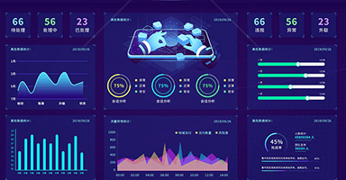
The easiest solution to visualize the large screen in 2021
The flexible plug-in solution is abandoned, and the more general css3: scale scaling solution is used to scale the content when the screen changes. The base size of the project is 1920px*1080px, so it supports 100% filling of the screen of the same proportion. If the proportion is not the same, it will automatically calculate the proportion to fill in the center.
