CSS custom properties (CSS variables)
Just like in every programming language, variables are just names assigned to memory locations where values can be easily stored. This allows variables to be reused in our programs instead of being repeated/hard-coded in multiple places in our code Actual value. As you probably know, global changes can be easily achieved by changing the value of the defined/declared variable, which in turn is reflected in each instance of the variable (the value of the variable is used in the variable).
Fortunately, the CSS specification allows such variables called custom CSS properties. These custom attributes are defined as name/value pair combinations, which can then be associated with elements. Use a double hyphen/two dashes followed by the name of the custom attribute and finally assign a value to it to define the name of the variable, for example:
example {
  --primary-color: #222;
}
To use this custom primary color attribute in a rule, you must call the function var() with the name of the custom attribute passed to it. E.g:
example {
  background-color: var(--primary-color)
}
As you have guessed, this is the same as the setting, background-color: #222 because the variable --primary-color is a placeholder for the actual value it holds
Scope
Depending on where these variables are defined, they can have a global scope, which means they can be accessed and used anywhere in our style sheet, or they can have a local scope that restricts their use to specific rules. In order to give a variable a global scope, it must be stored: root in the pseudo-class selector of our stylesheet. The target of this :root selector is the root element in our HTML markup, which is the element in our document. You can simply think of the :root selector as a representation of the element, but with higher specificity (priority)
:root {
  --primary-color: #222;
}
By declaring this variable in the root selector pseudo-class, it is given a global scope and can be used anywhere in our style sheet. E.g:
h1 {
  color: var(--primary-color)
}

div {
  background-color: var(--primary-color)
}
In order to give a variable a local scope, it must be defined in the rule set and can only be accessed within the rule set (local scope). E.g:
element {
  --primary-color: #fff;
  color: var(--primary-color);
  border: 2px solid var(--primary-color)
}
Overwrite global variables with local variables
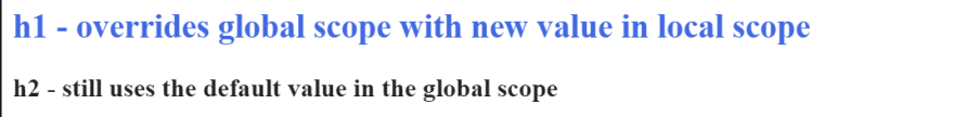
The most interesting feature of these variables is that when a variable defined in :root (global scope) is re-declared with a new value in the rule set (local scope), the new value will overwrite the value of the global scope , But only in that rule set. E.g:
:root {
  --primary-color: #222;
}
h1 {
  --primary-color: #4169e1;
  color: var(--primary-color);
}
h2 {
  color: var(--primary-color)
}
Implement dark mode function
HTML
For HTML markup, we just need to place this toggle switch and a div with a bunch of content
 <body>
    <!-- Toggle Switch -->
    <div class="switch">
      <input type="checkbox" id="switch" />
      <label for="switch">
        <i class="fas fa-sun"></i>
        <i class="fas fa-moon"></i>
        <span class="ball"></span>
      </label>
    </div>

    <!-- Content of Our Webpage -->
    <div class="content">
      <h1>Heading</h1>
      <p>
        Lorem ipsum dolor sit amet consectetur adipisicing elit. Expedita, non?
      </p>
    </div>
  </body>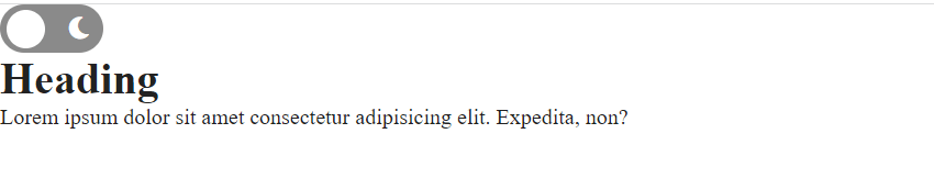
For simplicity, this is all the HTML needed for this implementation. The idea is that the content part represents the entire content of our webpage, and the switch is what we click to trigger the webpage change
CSS
This is where our CSS custom attributes (variables) play a key role. The concept is that we do not use hard-coded values to set the style of the website color scheme (various colors on the website), but store the initial mode of the website ( Light color scheme mode) as variables in the root style sheet (global scope), and then use these variables where we usually use ordinary hard-coded values. So let's do this:
:root {
  --bg-color: #fff;
  --primary-text-color: #222;
  --secondary-text-color: #444;
}
We have created three custom variables in our global root element, and now we will continue to use these variables to design our web pages. Let's first use flex to center all the content on the webpage, provide the background color for our webpage, and use these variables to provide two different colors for the content
body {
  display: flex;
  height: 100vh;
  flex-direction: column;
  justify-content: center;
  align-items: center;
  background: var(--bg-color);
}
.content {
  color: var(--primary-text-color);
}
.content p {
  color: var(--secondary-text-color);
}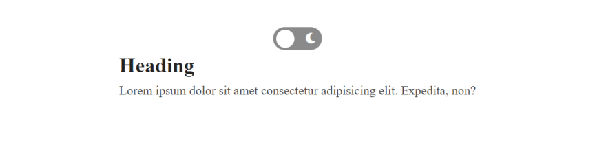
Now we will create a dark theme class rule set and redefine our global variables with new values tailored for the dark mode foreground
.dark-mode {
  --bg-color: #3e4c59;
  --primary-text-color: #fff;
  --secondary-text-color: #ddd;
}
The new value in the dark mode class will be used to override the value of the global variable when the toggle switch is turned on. This is done by using JavaScript to add this newly created .dark-mode class to our
switchTheme.addEventListener("click", function () {
  document.body.classList.toggle("dark-mode");
});


Post comment 取消回复