In this article, I will show you how to create an animated skill bar using only HTML and CSS code. I previously designed more types of progress bars. But in that case, I used JavaScript or JQuery. I only created this skill bar with the help of HTML and CSS code
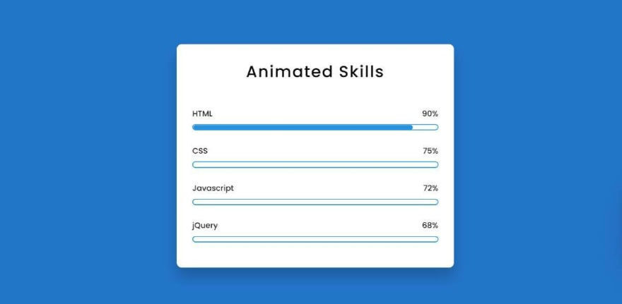
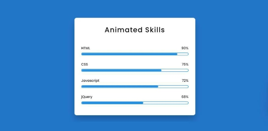
First I made a small box on the web page. Then I added a title to the box and used four progress bars. Each progress bar has a specific value. When you load this page, this animation will reach your intended meaning from scratch. You need two seconds to reach the predefined value, so we can see an animation here
Step 1: Design the website
First, I designed the web page using some CSS codes below. Here I used the background color of the web page blue
*{
    padding: 0;
    margin: 0;
    box-sizing: border-box;
}

body{
    height:100vh;
    background-color: #0a7aca;
}
Step 2: Create a box on the page
Now I have created a box using the HTML and CSS code below. As I said before, there is a box on the webpage in which all the progress bars are made.
I used box-shadow: 0 20px 30px rgba (0,0,0,0.2) here to create a color shadow around that box. I used border-radius: 10px to make it a bit round
<div class="wrapper">
  <div class="container">

  </div>
</div>
.wrapper{
width: 40%;
min-width: 590px;
position: absolute;
transform: translate(-50%,-50%);
left: 50%;
top: 50%;
}
.container{
width: 100%;
padding: 30px 30px 50px;
background-color: white;
border-radius: 10px;
box-shadow: 0 20px 30px rgba(0,0,0,0.2);
}
.container *{
font-family: "Poppins",sans-serif;
color: black;
font-weight: 500;
}
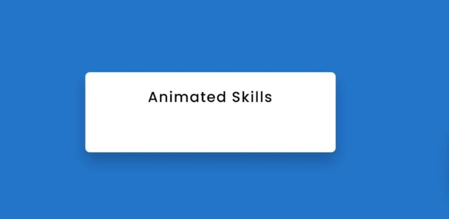
Step 3: Add the title to the box
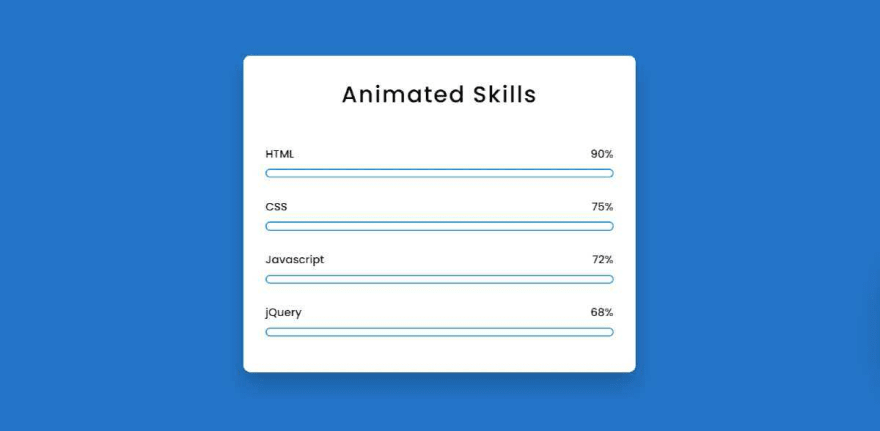
Now I have created a title using the code below. As shown in the image above, the title is used here. This title in font-size: 33px, and text-align: center has been used to place it in the middle.
<h2>Animated Skills </h2>h2{
margin-bottom: 50px;
letter-spacing: 2px;
text-align: center;
font-size: 33px;
font-weight: bold;
}
Step 4: Add all the information in the skill bar
Now I have added all the basic information of this animated skill bar using HTML code. First, I added information from one of the four bars in this progress bar. I have shown its possible results in the image below
 <div class="skills">
   <div class="details">
     <span>HTML</span>
     <span>90%</span>
   </div>
   <div class="bar">
      <div id="html-bar"></div>
   </div>
 </div>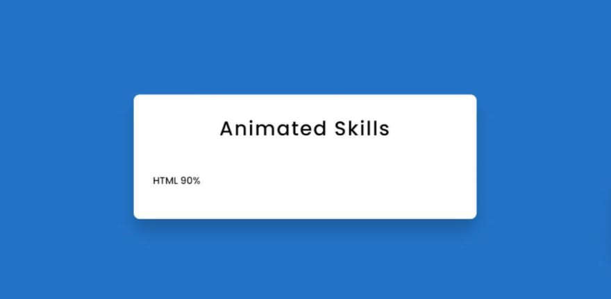
Above we added a skill bar information. Now I have added the information of the other three progress bars
<div class="skills">
   <div class="details">
     <span>CSS</span>
     <span>75%</span>
   </div>
   <div class="bar">
      <div id="css-bar"></div>
   </div>
 </div>
<div class="skills">
   <div class="details">
     <span>Javascript</span>
     <span>72%</span>
   </div>
   <div class="bar">
      <div id="javascript-bar"></div>
   </div>
 </div>
<div class="skills">
   <div class="details">
     <span>jQuery</span>
     <span>68%</span>
   </div>
   <div class="bar">
      <div id="jQuery-bar"></div>
   </div>
 </div>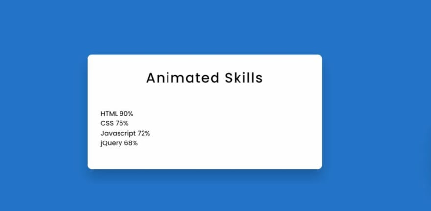
Step 6: Design the skill bar with css code
Now I have designed the above added information with the help of CSS code. Here I used a border border: 2px solid # 0d96e0 around the animation line I used. Here I used the height of the animation line: 9px.
I used to use border-radius: 10px to make the ends of the line even and rounded. I have used width: 0 as the animation line of the progress bar, which means that under normal circumstances, you will not see the skill animation here. Later I used @keyframes to give each value a different value
.details{
    width: 100%;
    display: flex;
    justify-content: space-between;
    margin-bottom: 10px;
}
.bar{
    position: relative;
    border: 2px solid #0d96e0;
    border-radius: 20px;
}
.bar div{
    position: relative;
    width: 0;
    height: 9px;
    border-radius: 10px;
    background-color: #0d96e0;
}
Using the CSS code below, I created a distance between each skill bar. For this margin-bottom: 30px use it will create a 30px distance between each bar
.skills:not(:last-child){
    margin-bottom: 30px;
}
Step Seven: Set a specific value for the animation of each skill bar
As mentioned above, I used the width: 0 progress bar animation line here, which means that the animation line cannot be seen under normal circumstances. Now I gave each different value.
I used the first line of width: 90% here, which means this colored line will stop at 90% when loading. I set a time of two seconds to make this animation
#html-bar{
    animation: html-fill 2s forwards;
}
@keyframes html-fill{
    100%{
        width: 90%;
    }
}
In the same way, I added specific values to the other three CSS progress bars. The more the width value changes, the more the value of the colored lines will change
#css-bar{
    animation: css-fill 2s forwards;
}
@keyframes css-fill{
    100%{
        width: 75%;
    }
}

#js-bar{
    animation: js-fill 2s forwards;
}
@keyframes js-fill {
    100%{
        width: 72%;
    }
}

#jQuery-bar{
    animation: jQuery-fill 2s forwards;
}
@keyframes jQuery-fill{
    100%{
        width: 58%;
    }
}


Post comment 取消回复