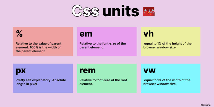
When developing a responsive website suitable for various devices, it is important to understand the correct CSS units. But before delving into the decision-making, let’s categorize them to understand their category
Absolute unit
- px: pixels
- pt: point
- pc: Picas
- in: inches
- cm: centimeters
- mm: millimeter
Percentage unit
- %
Relative Unit
- Relative to font size
- em
- rem: root em
- Relative to the view window/document
- vw
- vh
- vmax
- vmin
The most common unit
px
The absolute pixel unit is only used for the screen (interface), and the remaining units are used for printing. The px unit is not a good choice, in fact it is not used for scaling. No matter what screen size you choose, the size in px unit is fixed. This is why the px unit is always preferred for the border, because the border remains fixed on all screen sizes
%
This is used to set the width of the element, which is always relative to the size of its immediate parent element. If there is no parent defined, the subject is considered the parent by default
A box with a width of 500px with an h1 element inside
.box{
  width: 500px;
  border: 1px solid crimson;
  padding: 10px;
}
h1{
  width: 50%;
  border: 1px solid;
}
👉If no parent is defined, then root will be regarded as the default parent
em
The em unit is always relative to the font size of its immediate parent. 1em == the size to the parent font size. If it is not overridden, the default font size is 16px, assuming that the font size in the parent element is 48px, and then 1em == 48px in the child element
h1{
  font-size: 1em; /* now 1em == 16px */
}
.container{
   font-size: 48px;
/* or 3em, because default font-size is 16px
& it's parent is body so, 3*16px will be 48px */
}
h1{
   font-size: 1em; /* now 1em == 48px */
}
We can use this unit for margins and padding because it allows us to use flexible spacing around the box based on the font size of the element. Therefore, the font-size of the element will change according to the device size, so the spacing around the element will also change separately
rem
r stands for root em. Unlike em, it is always relative to the root font size, regardless of the font size of its next parent element. If the root has redefined the font size, such as 60px, then 1rem == 60px in the child
html{
   font-size: 60px;
}
.container{
   font-size: 16px;
}
h1{
   font-size: 1rem;
}
vw
vw represents the width of the viewport, which means that vw is always 1% relative to the root width, regardless of the width of the parent element. So if 1vw == 1% then 100vw == 100% viewport width
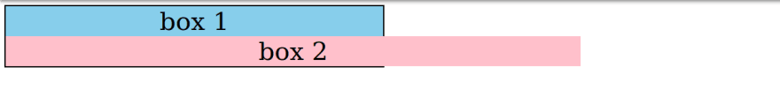
Let us consider the following example, where the width of one child is relative to the parent size, and the width of the other child is relative to the root
.container{
  width: 600px;
  border: 2px solid black;
  text-align: center;
  font-size: 20px;
}
.box1{
  width: 100%;
  background: skyblue;
}
.box2{
  width: 70vw;
  background: pink;
}
vh
vh stands for the height of the viewprot, like vw it is also relative to the 1% height of the root/document.
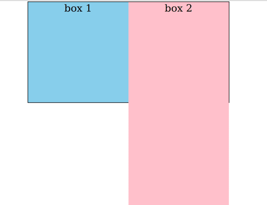
Let us consider the following example, where the height of one child is related to the parent size, and the height of the other children is related to the root
.container{
  border: 2px solid;
  font-size: 40px;
  width: 800px;
  height: 400px;
  display: flex;
  text-align: center;
  margin: 0 auto;
}
.box1{
  height: 100%;
  width: 50%;
  background: skyblue;
}
.box2{
  height: 100vh;
  background: pink;
  width: 50%;
}
Summary
- px: pixel unit of the border
- %: For the width unit of the parent
- em: the em unit of margin and padding relative to the font size of the element
- rem: rem unit relative to the font size of the root
- vw and vh: Indicates the width and height relative to the root
These are 6 css units and they are most commonly used to make websites responsive


Post comment 取消回复